Building a kick @ss deck
Let’s face it: first impressions can make or break your startup. At a demo day or conference (or investor pitch), you NEED to be memorable, compelling, and unique. Next week we’ll talk about the pitch itself. But this week, let’s talk about the actual pieces parts.
We invited investor Dan Levine of Accel Partners to talk about deck contents, and designers Susan Dybbs and Peter Duyan from Cooper to discuss deck aesthetics. Here’s what we learned:

Dan Levine sees hundreds of pitches weekly and knows what information investors are really looking to pull out of a presentation.
The pitch is the product
What is your objective? In the case of a demo day, it is most likely to get funding. It’s not common for an investor to write a check after a 15-minute presentation. Instead, your objective is to get a follow-up meeting where you can close the deal. Get them interested and after the presentation, stand in an easy accessible place and get ready to connect.
Content
Cut to the chase. There should be a reason for everything in your presentation. When putting together the deck, start with a mind map of everything you can possibly talk about. Then, cut it down to the bare minimum. A basic outline for a good pitch consists of:
- Background & intro to team
- Define the problem you are tackling
- Size of opportunity (numbers, please)
- Explain Solution (video demo / product screen shots)
- If appropriate explain how will you get customers and make money
Remember that no one will remember the details of your presentation, so keep the points direct and consistent. Keep a balance — you don’t want your audience to get lost in the details or distracted by their iPhones. Keep them focused with a clear, energetic, and engaging presentation.
Main take-away: hone in on the actual purpose of your pitch and leave the extra fluff out.
Now that you have the content outline, our design friends have some suggestions for connecting with a narrative and engaging the audience through beautiful and dynamic graphics.
The anatomy of a good story
1. Set the stage. Who are you, why are you here, and what do you have to offer?
2. Identify the problem. What makes it a big deal, who is it effecting, why the audience should care?
3. Present your solution. What are the most essential elements, can you show a demo, what are the wow factors?
4. Be engaging. How are you going to tell the story? Exhibit how excited you are and relate to the audience. Think of the master of telling the product’s story- Steve Jobs. His passion for the product is contagious. Watch his iPad demo here.
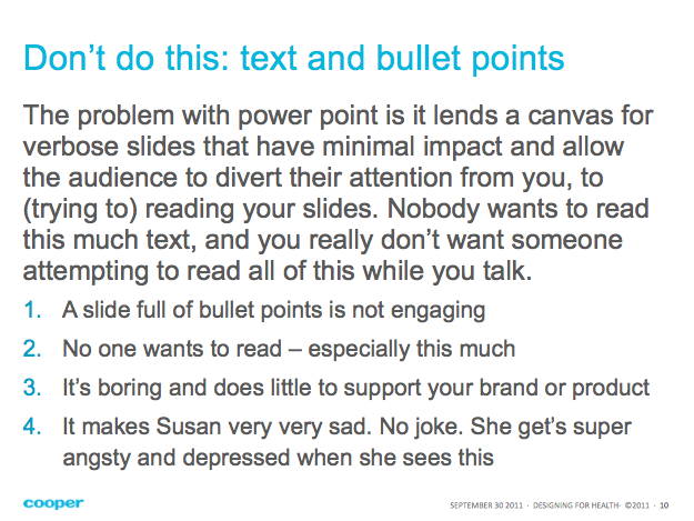
It doesn’t matter how great your story is if you put it on a busy slide that looks like the one below. The audience will begin to read the content and your voice will be lost.

Using Text Effectively
- Watch your line length. Don’t have lines that go across the whole slide. At most, lines should be about 10-15 words.
- For a big statement, try big text in the middle of the page.
- Call out important words with color or semi-bold font. Be careful using fonts that are too bold.
Imagery
Pictures are a great way to complement what you’re saying, and they grab an audiences’ attention. Some tips for mixing text with images:
- Put the text directly onto an image’s negative space (below, left)
- Use a tab of solid color (below, middle)
- Divide the slide (below, right)
Slide Layout
Mix up the layout of your slides to create a rhythm and keep tension in your presentation. Chose one or two different layouts that speak to your content. See how the above layouts stream together well.
PRACTICE, PRACTICE, PRACTICE
Now that you have great content and layout, practice a cohesive narrative that is supported by your kick-ass deck. More on this next week.
