Cooper Workshop: Visual Interface Design Tidbits
Beautifully designed interfaces can seduce users to spend more time with a product, share it and be more forgiving when something goes wrong. So how does one go about building an alluring experience that makes people stand up and take notice? The talented Nick Myers of Cooper Design took us to visual design school to find out.
We started the discussion by identifying who does this well. Our straw poll revealed that, to no one’s surprise, Apple and Virgin America rise to the top, both in terms of their visual design and brand experience. Virgin’s site is clean, consistent, easy to understand and attractive. And the attention given to experience permeates the rest of their mobile apps and the physical experience of traveling with them. From the moment you bring up the website to the moment you step off the plane everything is thoughtfully done, well designed and supports their brand. And best of all, it makes the process of booking a flight and flying much less painful than is typical.

So now that we know we like this design, what specifically makes it so great? Nick illustrated some of the principals like prioritization, organization and association because as with art, interface design is a marriage of basic principles and a bit of creativity. While we can’t teach you creativity, the following basic design principles can carry you halfway there.

Visual Weight can be used to guide the view’s attention to certain areas or provide balance. Weight can be achieved through color, complexity, size, density and proportion. Read more here.
Affordance is how you perceive that you interact with an object. When designing for the web, this means objectifying parts of your interface to portray to the how the user can interact with it. A perfect example is the button. This common tool is something we use every day in the physical world. By using similar shapes, colors and shadows we instinctively know how to use it. At that point, our past experience takes over, and we understand how that tool works.

RVMF (rich visual modeless feedback) are notifications delivered with the intent of disrupting the work flow of the user. The email inbox has several great and simple examples. New emails are bolded, and a number increases when each new one comes in. RVMF is most effective at presenting changes in status, progress or in displaying errors. See examples and read more here.
Hierarchy helps to prioritize through position, color, lines, size and weight to indicate that importance. Identify the major goals and points of importance and emphasize them with those techniques.
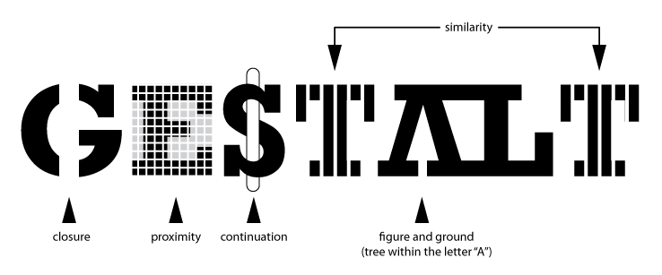
Association and contrast convey similarity or differences between objects or images. Many of these are based upon the instinctual psychological principals developed by Gesault. He determined that the sum is greater than the parts, so considering how all the parts to work together to deliver the message is key.
Now that you know some of the tricks to interface, it is time to tell you the most important rule. Always be removing! It takes practice and expertise to know how to create a clean design, and how sparing to be with text, images and effects. Putting too much on one page dilutes each individual element’s power, and your interface will lose its clear message. That is why it is so essential to prioritize and plan before building.
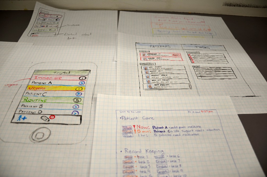
Our teams were put to work to see what they could do with the design tools. They were asked to think through a nurse’s task list and include different priorities of levels and notifications. Below are some of the sketches that utilized the interface design principals.
Good Reads:
- Designing Brand Identity ( Alina Wheeler )
- Designing Visual Interfaces (Kevin Mullet & Darrell Sano)
- Designing Interfaces (Jenifer Tidwel)
- Smashing Magazine