Cooper Workshop: Time to Design
Ready, set, DESIGN! After weeks of constructing a sturdy foundation, it is time to get in there and make your product a reality. Just like an architect, you begin with a rough blueprint of the elements you uncovered during research; understanding your users, their requirements and desired product interactions. Start BIG and fill in the detail only when you know how all the parts work together.
So you might be asking: Where do I start? How much detail should I include? What do you use? Any other advice? Glad you asked:
Don’t reinvent the wheel!
Yes, it’s tempting, but don’t create extra work for yourself. There are many principles and patterns in design that take the extra thinking out of it. Consider them general rules to rest on.
Use design principles
These are rules based on research or good old fashioned common sense. For example, humans can remember seven items plus or minus two. A great reference for these principles is William Lidwell’s Universal Principles of Design.
Design patterns
Think of these as abstract solutions to known problems, or taking what you know about how users will interact and look for known solutions.
- Posture: What stance does it take toward users? Is it a sovereign application that users will spend lots of time using, like email interfaces or Excel? Or is it a Transient application that users do not regularly access or spend short amounts of time like widgets. Sovereign applications have less instructions and have more features while transient applications need more explanation and less features.
- Structure: Where are users accessing this application and how much detail will they need? An iPhone application will be accessed differently than an iPad or a laptop, which means the spacing, type and amount of information on each page will be unique for each.
- Behavior and interaction: What will they be doing with it? Managing tasks, finding a document? What will they use most? The answers to these questions will help you focus on the central parts.

To the drawing board!
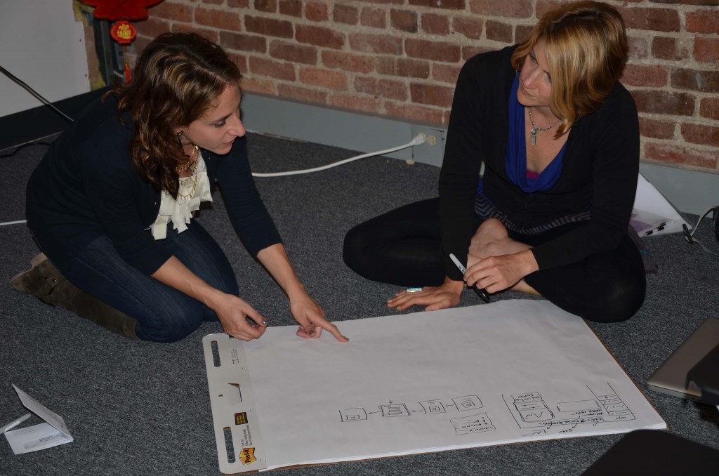
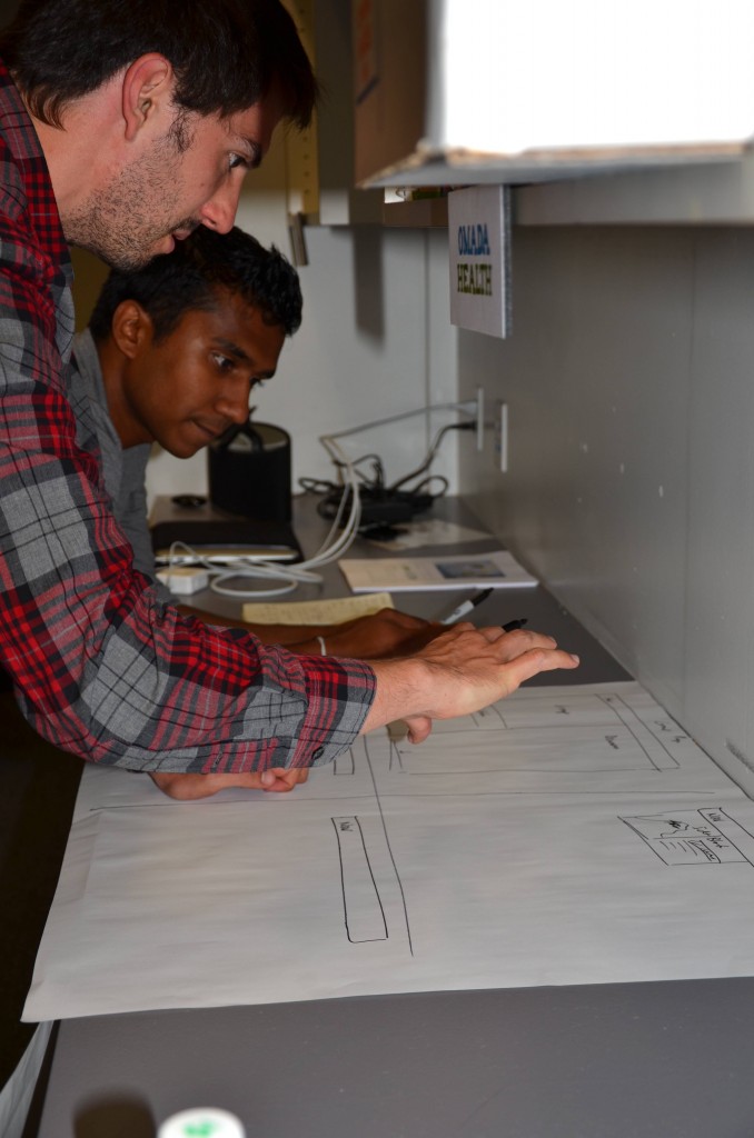
Once you have these concepts and ideas, it is vital to start with sketches of the different interfaces you will need. Avoid detail to ensure the big parts are all there. Most programers are dying to start building a full product but this wastes time and creates more problems when you decide to make big design changes later on. Follow these steps to help to help you stay on track.
1) Sketch the interaction framework
Start by drawing a rough outline of each view and identify them (examples in Outlook: calendar, email, task list). Typically these pages are centered on different activities. Beginning on paper and pen will help to ideate quickly and then rework on the fly. After you are confident with a draft you can use a program like Balsamiq to make more professional sketches.
2) Lay out the panes within each view
Give each names and definitions, and discuss the relationships among them like grouping, size and positioning.
3) Explore key interactions
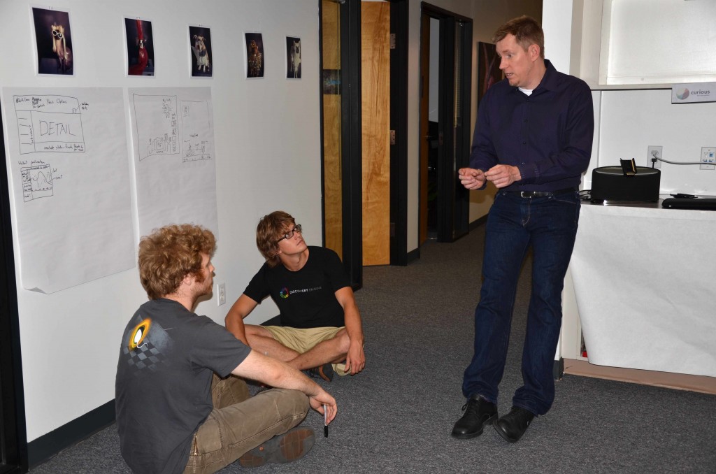
These take attention to detail, so go deep and board to deliver stacks of ideas. These can be anything from your unique navigation or method of displaying graphs. Bust out loads of different ideas to cultivate the best pieces from each. This is where you might want to reinvent the wheel.
4) Iterate and check for inclusion of all elements
Does it flow well together, did you forget any elements or requirements form the foundational research? Go back to your personas and scenarios to be sure that you are confident with your design before moving into detail. This may seem redundant but it can save time in the long run and make a more effective product.
Good Reads:

